Like many people, I’ve been playing some chess recently. Specifically, I’ve been playing on lichess, which is a free and open-source online chess server. The site has a ton of cool features, and they are adding new ones on a regular basis.
After you finish a game on lichess, you can view an ‘analysis board’ for that game, and request a computer analysis. The computer analysis runs the chess engine stockfish behind the scenes, and when it is finished, one of the outputs is an ‘advantage chart’ that looks like this:
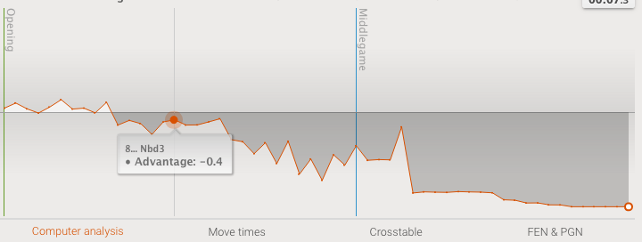
I got this specific advantage chart by randomly selecting one of the top games from https://lichess.org/games and requesting a computer analysis. You can see the same chart (and the game) for yourself by going to https://lichess.org/FOECOsol. For this game, the advantage was equal or slightly in white’s favor at the start, but black took over on move 6, and retained the advantage until checkmate was achieved on move 28. If you go to the game url, you can replay the game and see annotations along with some alternate lines for the best moves as calculated by stockfish. Before you judge the players too harshly for making mistakes or blunders, look at the time control for this game - it is ‘1/2 + 0’, which means that each player has a 30 second clock for the entire game, and no extra time is added for moving.
In order to make this plot with Python, you first need to download the annotated game file by clicking on the ‘FEN & PGN’ link under the plot, and selecting the ‘Download annotated’ option. There is a chess library for Python, python-chess, which can parse the downloaded PGN file. If you want to replicate my work, make sure that you have version 1.3.3 or higher installed, as I will use some features that only showed up in v1.3.3.
How is the advantage calculated? First of all, stockfish gives an ‘evaluation’ for each position in the game. In the PGN file, this is given in a comment after each move that looks like this: ‘[%eval -0.13]’ or this ‘[%eval #-5]’. If there is a ‘#’ symbol, it means that a checkmate is possible in that many moves, and the sign determines which color can mate. For example, ‘#-5’ means that black can checkmate in 5 moves. In the game I’m using as an example, if you look at the downloaded PGN file, you’ll see that after white makes the move Qe4 on move 26, the evaluation is ‘#-3’, and indeed black checkmates in 3 moves.
If the evaluation is just a number (no ‘#’ symbol), then it represents the strength of the position. A positive number means that white has an advantage, and a negative number means that black has an advantage. Roughly speaking, a value of +1.00 means that white has an advantage equivalent to a 1 pawn piece advantage in an ‘average’ position, but there are many caveats to this. If you are interested, you can view the code that calculates the evaluation here.
The advantage plot that lichess shows does not directly report the evaluation. For one thing, you can’t really mix numbers and ‘mate in N moves’ on a plot. For another, if you mouse over the plot, you’ll notice that the vertical scale is not linear. Differences in advantage closer to zero are emphasized more than differences further from zero - it looks like a log scale.
In fact it is logarithmic, which I’ll explain after I first show how to recreate the plot. In Python it only takes a few lines with the help of a list comprehension (most of the code is for the plot details):
import chess
import chess.pgn
import matplotlib.pyplot as plt
import seaborn as sns
import math

pgn = open('lichess_pgn_2021.01.24_yesaiedo_vs_GreenNight.FOECOsol.pgn')

game = chess.pgn.read_game(pgn)

eval_list = [2*node.eval().white().wdl(model='lichess').expectation() - 1
             for node in game.mainline()
             if node.eval()]

fig, ax = plt.subplots()
fig.set_size_inches(15, 15 / 3)
g = sns.lineplot(data = eval_list, ax = ax, color = 'blue');
g.axhline(y=0.00, color='r', linestyle='-');
plt.ylim(-1.2, 1.2);
sns.despine()
plt.show()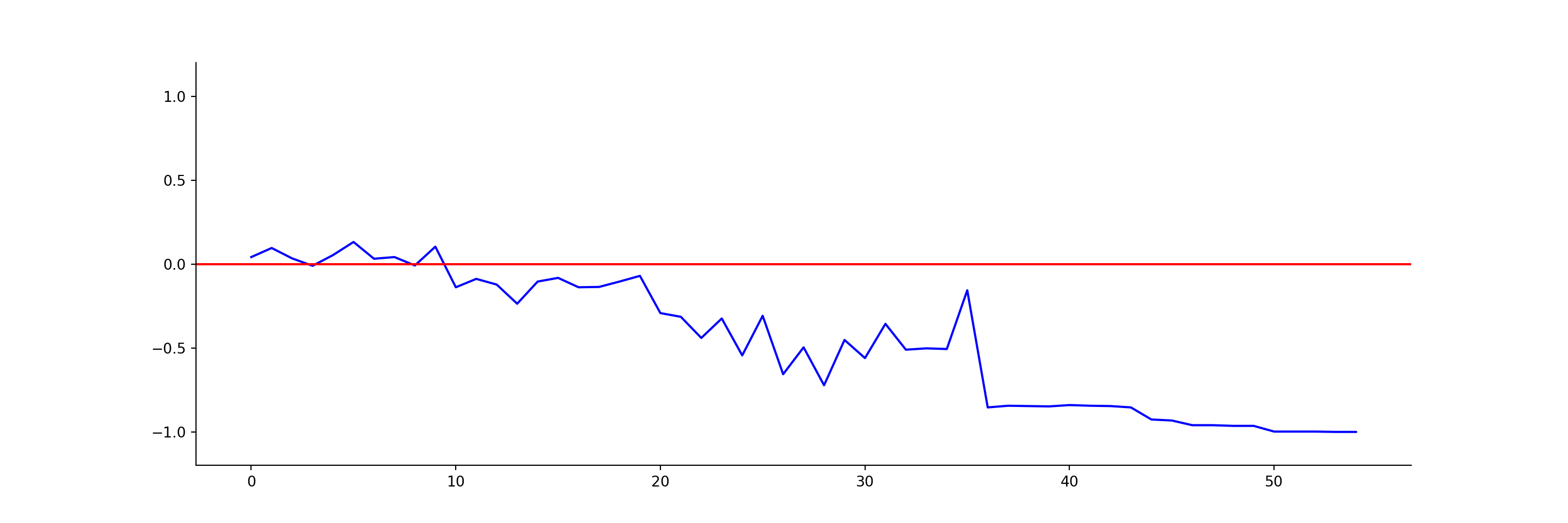
It is definitely the same plot! It could be cleaned up, tooltips and shading added, and so on, but the basics are there.
How does it work? The list comprehension loops through all of the nodes (positions) in the mainline of the game (the moves that were actually played). It only includes positions that have an evaluation - for example, the final move in this game was a checkmate for which the position is not evaluated. Then node.eval().white() gives the evaluation of the position after the move from white’s point of view. This is reported either in centipawns (1/100th of a pawn) or in moves to checkmate. This value reported in either units of pawns or of moves to checkmate is what is shown in the plot tooltips on lichess. However, this is not what is actually plotted.
The evaluation is fed into a function that lichess uses to estimate the winning chances of a position. The probability for white to win is given by
\[ \frac{1}{1 + e^{-0.004*\text{cp}}}, \] where ‘cp’ is the evaluation in centipawns. In python-chess the raw centipawn score is first truncated to the range [-1000, 1000] by setting values above or below this range to the nearest limit. This win probability is multiplied by 2 and then 1 is subtracted in order to map it symmetrically onto [-1, 1].
If the evaluation is a mate in N moves, it is converted to a centipawn score in python-chess as follows:
\[ \text{cp} = 100*(21 - \text{min}(10, N)), \] and this centipawn score is then fed into the above win probability formula, in this case not first truncating to the range [-1000, 1000].
There is an element of discretization involved as well, though it is probably hard to see in a plot. The average winning probability (.expectation() in the code) is calculated out of 1000 games, where the number of wins is given by
\[ \frac{1000}{1 + e^{-0.004*\text{cp}}}, \]
rounded to the nearest integer.
When lichess actually makes the plot on the website, they ignore many of these complications, and just set the centipawn score for ‘mate in N’ to infinity or negative infinity, leading to a win probability of 0 or 1 (and thus a plot point of -1 or 1), depending on which color has the mate. You can view the code here.
This doesn’t make much of a difference in most advantage plots. Let’s see how things change for our example game if we use the simplification. It actually takes more code because we can’t use some of the built-in functions that python-chess provides.
sym_evals = [node.eval().white()
             for node in game.mainline()
             if node.eval()]

# I'm using 'a very large number' instead of 'infinity'
scores = [position.score() if position.score()
          else 10000*position.mate()/abs(position.mate())
          for position in sym_evals]

plot_nums = [2 / (1 + math.exp(-0.004*score)) - 1
             for score in scores]

fig, ax = plt.subplots()
fig.set_size_inches(15, 15 / 3)
g = sns.lineplot(data = plot_nums, ax = ax, color = 'red');
sns.lineplot(data = eval_list, ax = ax, color = 'blue');
g.axhline(y=0.00, color='r', linestyle='-');
plt.ylim(-1.2, 1.2);
sns.despine()
plt.show()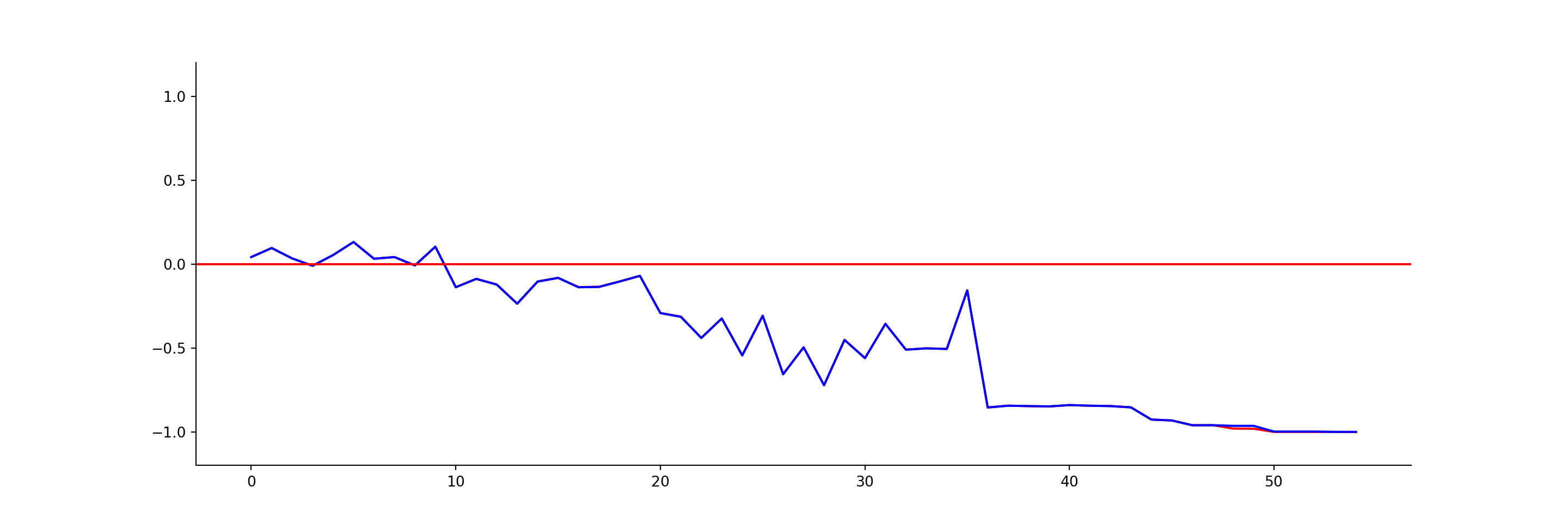
Things look almost exactly the same. If you look closely, there is a small difference visible around 48 on the x-axis, so I’ll zoom in on that section. The python-chess output is in blue, and what lichess actually plots is in red:
fig, ax = plt.subplots()
fig.set_size_inches(15, 15 / 2)
g = sns.lineplot(data = plot_nums, ax = ax, color = 'red');
sns.lineplot(data = eval_list, ax = ax, color = 'blue');
plt.xlim(45, 55);
plt.ylim(-1.02, -0.92);
sns.despine()
plt.show()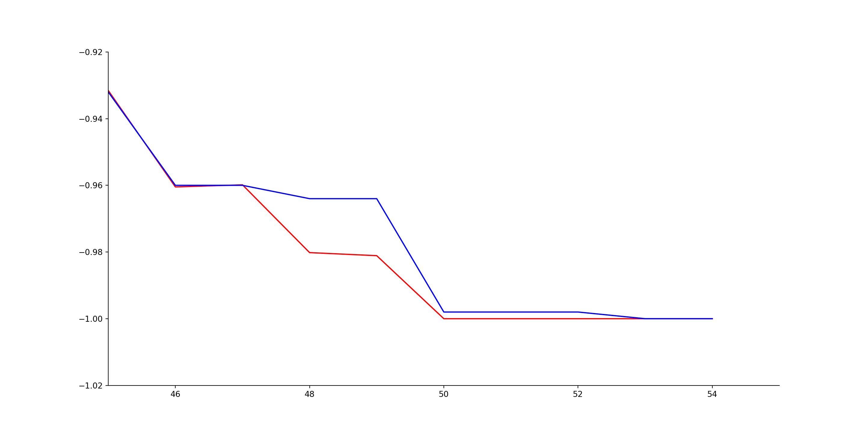
Let’s calculate the difference at one specific point. The point at 48 on the x-axis has an evaluation of -1151 centipawns. Lichess plots this as
\[ \frac{2}{1 + e^{0.004*1151}} - 1 = -0.980, \] whereas the python-chess output first truncates the centipawn score to -1000, and calculates a rounded number of wins out of 1000 games:
\[ \text{round}\left(\frac{1000}{1 + e^{0.004*1000}} \right) = 18. \] Then for the python-chess plot,
\[ 2 \times \frac{18}{1000} - 1 = -0.964. \] The resulting lichess plot point (blue) is higher than the python-chess plot point (red).
In either case, this is a simplified way to calculate a winning probability - it just maps the evaluation onto a logistic curve. To add just one complication, it doesn’t attempt to model the probability of a draw. It also doesn’t consider the stage of the game - in reality a +100 centipawn evaluation might have quite a different meaning in the opening as opposed to the endgame. So you probably shouldn’t attempt to assign too much meaning to the details of the advantage plot. Stockfish has its own more complicated winning probability function, but that is beyond the scope of this post.